Followers

Thursday 29 September 2011

Rolling Stone Music Magazine Annotation


Rolling Stone Magazine


The masthead it self holds a lot of semiotics for me to discover, the masthead is one of the main parts of a magazine as it holds the main image of the magazine itself. So that is the visual part of semiotic system.  The main feature article photo is another important thing, you can tell what this magazine will involve, and from my own knowledge I know that ‘Wiz Khalifia’ is a Hip – Hop artist so I now know that this music magazine will mainly about the genre ‘Hip – Hop’. The target audience of this magazine will most properly be aimed at the people who listen to rap and hip – hop styled music and to maybe the younger generation who are more stereo typically into this sort of music style.  Plugs are a very crucial thing within a magazine, e.g. they draw you in even further, and they purposely make the text linguistic to succeed in this. Connation’s are used in this magazine but not over the top, for instance, the ‘new faces’ text suggests a small connotation of making the reader want out find out what happens.


Digital Mock Up (Contents Page)

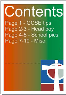
Here is my contents page for the preliminary task, I created this page on the corel draw software, I also made the contents page text refered to my front cover!

Here it is:
Contents Page

Diary

29th September 2011

In this lesson, I have completed my preliminary task for the school front cover. I did exactly what I wanted to do with my planning draft one. It was very interesting using corel draw for the first proper task so I look forward to doing my music one!

I am now starting my digital mock up contents page for this task on corel draw, this shouldn't take too long to do, but I should hopefully have it finished by the end of this lesson.

I have now completed the contents page, you can now see this under the 'Preliminary Task' label section.

The School Font Cover (Preliminary Task)


My School Front Cover
After my planning and research towards school magazines, here is my front cover of my own school magazine for the preliminary task. It has everything on it from which I planned. And overall, I think that it is very eye - catching!

Wednesday 28 September 2011

Diary

26th September 2011.

In this triple lesson we have started the study of semiology. A sign is split into two parts a 'signified' & a 'signify'. The 5 semiotic systems are; linguistic, visual, audio, gestural & spatial. This then breaks down to 3 parts 'Iconic', 'Index' & 'Symbolic'. We practiced this on two images, one being a dove image and the other being a black raven image. We did this to practice how we think about things and what images and signs have power. For example; everyone in the class beileved that the dove resembled peace and love. Whereas, the raven represented evil.  

Diary

 Week ending 26th September 2011.

During this time I have played around with the Coral draw software, only to get to grips with it. Having Mr. Bocahek there made it a lot easier as I was able to ask him questions about how to do specific things, like over lapping text over a picture.

I have also started the creation of my preliminary task, adding just the 'mast head' and 'main article photo'. This task was set for the next coursework lesson so that in that lesson we could finish off this task of the school front cover magazine.

Friday 23 September 2011

Choosing the 'perfect' photos!

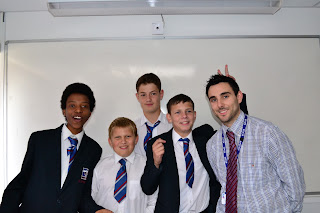
 Here are the outcome of my shots around the school! I mainly focused on students/teachers as the school itself looked a bit messy due to some reconstructioning... However I have to select 2-3 pictures for my front cover so below these pictures will be my final photos!


How did I eliminate these photos to a choosen 2-3? Well I did this by thinking which ones would look the nicest (in my eyes) on the magazine... I looked for action and good lighting, this would then make my magazine more eye catching! I decided I would have the 'Mr. Morris & students' why? I think its important to show the relationship between the teacher & his students! I also decided that the 'hall' picture would also be a good photo to be used in the magazine! And lastly, I decided the 'piano' picture would be good picture to use as it signifies 'skill' 'passion' and 'creativity'.

'Going Around The School' (Photoshoot For Magazine)

Today is the day for me to venture around the school to look for some interesting opportunities to take photos for my school magazine!

I am looking for some action shots (for example, a student at work). I am also going to take some architectual shots (E.g. School Building, Class room or objects within the school etc...). And lastly, I would like to maybe get a group shot of some students smiling!

Shots like these will make my magazine stand out & it will make it look just that little bit more eye - catching! From these shots, I will choose a select few to be in my magazine!

Tuesday 13 September 2011

Diary


Week beginning 12th September 2011.

In this lesson I have researched a music magazine (XXL Magazine). This is a high levelled music magazine and is aimed at the target audience genre of Hip – Hop & Rap. It is very clear and catches the eye almost immediately, for these reasons and for my own personal opinion of ‘good music’ I choose this magazine to research for my upcoming project of publishing a music magazine!

I also annotated a school magazine published as 'Fly'. I annotated this magazine to help me research and to design my school front cover for thier magazine... it did help and I got a few ideas and what layout works best.

After I had done that, I then made a draft copy of my school front cover!

Front Cover Of The School Magazine (Draft)

My Draft Front Cover

Monday 12 September 2011

School (Random Choice) Magazine Annotation


Fly School Magazine
This is a typical school magazine, randomly chosen by me to annotate in preparation of creating my own schools magazines front cover... it does indeed have its advantages and dis - advantages.


Advantages would be:
ü  Has a strong article picture
ü  Clear mast headline
ü  Good use of ‘Puff’
ü  Good use of contrasting colours
ü  Clear date headline
ü  Plug is used
ü  Different text sizes means that it is a bit more eye – catching
ü  Has a main cover line
Dis – advantages would be:
û  Lack of font use
û  No typeface used
û  No issue number
û  Some text could have been arranged to make room for a few more things such as maybe another picture or an issue number etc…


XXL Magazine Annotation

XXL Music Magazine

This music magazine appealed to me as I am a big fan of the ‘Hip – Hop/Rap’ genre… so I thought it would be a wise move for me to annotate it for my future publishing of a music magazine consisting of a: Front cover/Contents page/Double page spread.
Advantages of this magazine would be:
ü  Clear brand logo (Masthead)
ü  Good choice of the main feature article photo
ü  Lots of point sizes means that this front page is a lot more eye – catching
ü  Clear barcode
ü  Use of issue number
ü  Good use of ‘Puffs’
ü  Again, good use of ‘Plugs’ too
ü  Cover lines are also made bold + clear
Dis – advantages would be:
û  Cover price could be a lot more clearer to the reader
û  ‘Typeface’ isn’t really used in this front cover